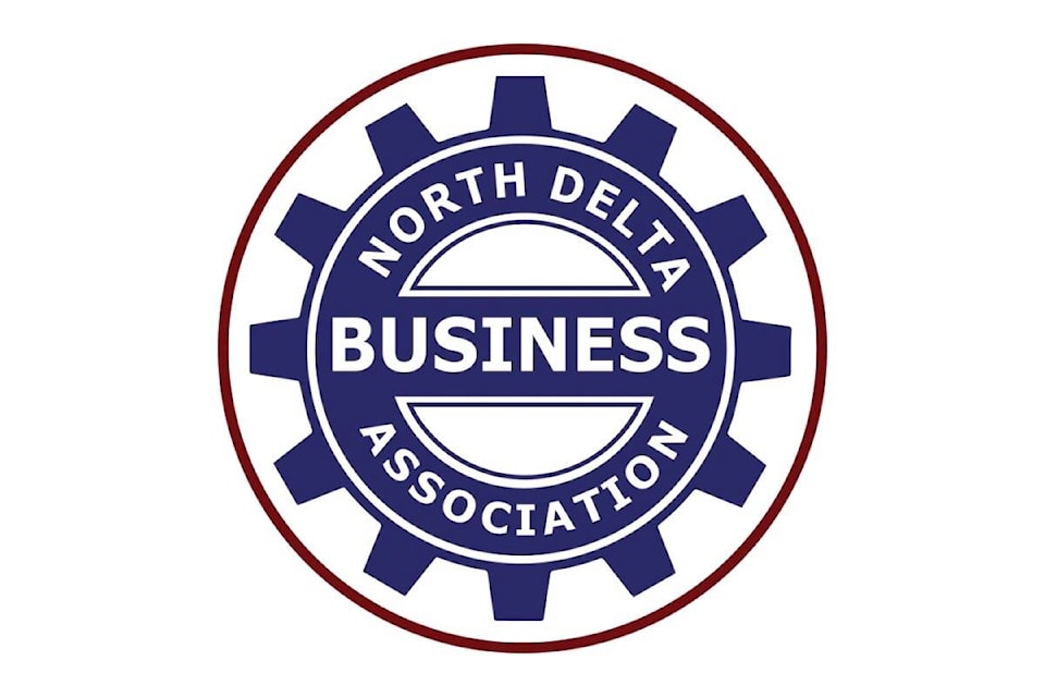
The North Delta Business Association has launched a new brand identity it says is more reflective of its strategy as an organization.
The updated logo and colour scheme were unveiled at the NDBA’s “Connections” social for members at the Delta Lion Pub on June 14.
The decision to make the change was “based on the fact that brands must be reflective of an organization’s strategy,” president and founding director Ian Tait said in a press release.
“Since officially launching in April 2022, we have created a revolutionary new strategy for our organization to separate itself from other associations, as declared by our ONLY statement,” Tait said, referring to a key piece of the organization’s branding that reads as follows:
“The North Delta Business Association is the ONLY team that (1) links you to other businesses, (2) connects you with experienced and knowledgeable people to help you lead and grow your business, and (3) constantly challenges you to do things differently.”
Director and chief marketing officer Roy Osing said the new brand identity speaks to the association’s strategy more effectively than the previous one.
“We are here to serve the needs of businesses, period. We are in business to help businesses grow their business. We encourage our members to do things differently. Our roots are proudly in North Delta, but we serve any business who needs our support, regardless of where they are located.”
Each aspect of the new logo’s design expresses a different part of the new brand identity.
The cogs, which are help over from the previous design, continue to convey the NDBA’s commitment to execution, delivering on our promises in a seamless way. The red ring encompassing the logo signifies the NDBA is the only organization that does what it do.
The deep colours speak to the organization’s depth of our understanding when it comes to what businesses need to grow and prosper, while their bold tones show the intensity with which the group achieve its goals.
SEE ALSO: Hundreds rally in Vancouver to support striking B.C. port workers
editor@northdeltareporter.com
Like us on Facebook and follow us on Twitter
